Working Process
This page is a long description of how I produce an oil painting, step by step. It is intended for other painters. It may be of interest to people wanting to know what it takes to make one of my paintings, but it doesn't include all the workspace, lighting, easel, photography, painting storage, hanging, framing, gallery and show things etc.
List of Materials
Drawing and Panel Prep Mats:Halfscale Sketch Paper, Templates, 18" clear Rulers etc.
90 lb Stonehenge Pearl Grey 30 x 22 paper sheets
.3 MM Mechanical Pencils, stick erasers, Kneaded Erasers
Graphite Transfer Paper and Stylus, masking tape
1/2" Birch Panels From Home Depot, and saws to cut to size
Acrylic wood patching material to fix any wood flaws. Golden GAC100 Acrylic Sealer
House painting brush or roller and pan for Gesso
Liquitex Acrylic Gesso White
Liquitex Tinting Acrylics for tinting the Gesso
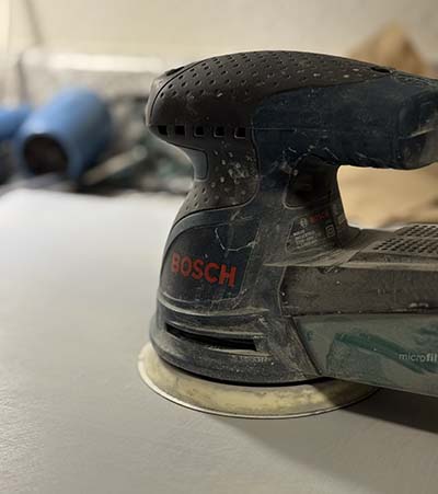
Random Orbital Circular Sander and sanding discs 400 grit
40 grit and 600 grit sandpapers for misc. purposes
Painting Mats:
Princeton Select flat blenders and spotters brushes 2, 4, 6, up to 1 inch.
Approx. 9 x 4 inch glass tiles with grey backing from Home Depot as $4 palettes
Razor Blades to clean palette and apply thin lines
Utrecht Classical Oil Painting Medium
Refined Linseed Oil and Stand Oil Mediums sometimes
Safflower Oil as brush cleaner
Mr. Siga microfiber towels as wiping and glazing rags
Paper towels for cleaning brushes
Palette knife, one very flexible and soft elongated diamond shape
Standard Palette (Split Primary-ish):
MH Lead White - main white
Titanium White - stronger tinting white.
Mars Black - main warm tinting black.
Ivory Black - cooler glazing black.
Cad Red Light/Medium, Quin Magenta, sometimes Venetian Red
OH Raw Umber, Yellow Ochre
Cad Yellow Light, MH Lead Tin Yellow Lemon
Gamblin Terre Verte (Viridian and Raw Umber)
Ultramarine Blue, Cobalt Blue
To Do:
I need a better solution to brightest whites. Lead white in linseed oil naturally yellows towards a flesh tone. I should tend flesh tones towards pink, and use better for white angel outfits. I.e. titanium + zinc + walnut oil
I would like to try using more Viridian like Van Gogh. I prefer cool temperatures for a restful, contemplative mood. I don't really like using Burnt Umber or Burnt Sienna just because they afford a temperature complexity throughout the painting. I focus on limiting warmth to the skin tones.
Drawing Process
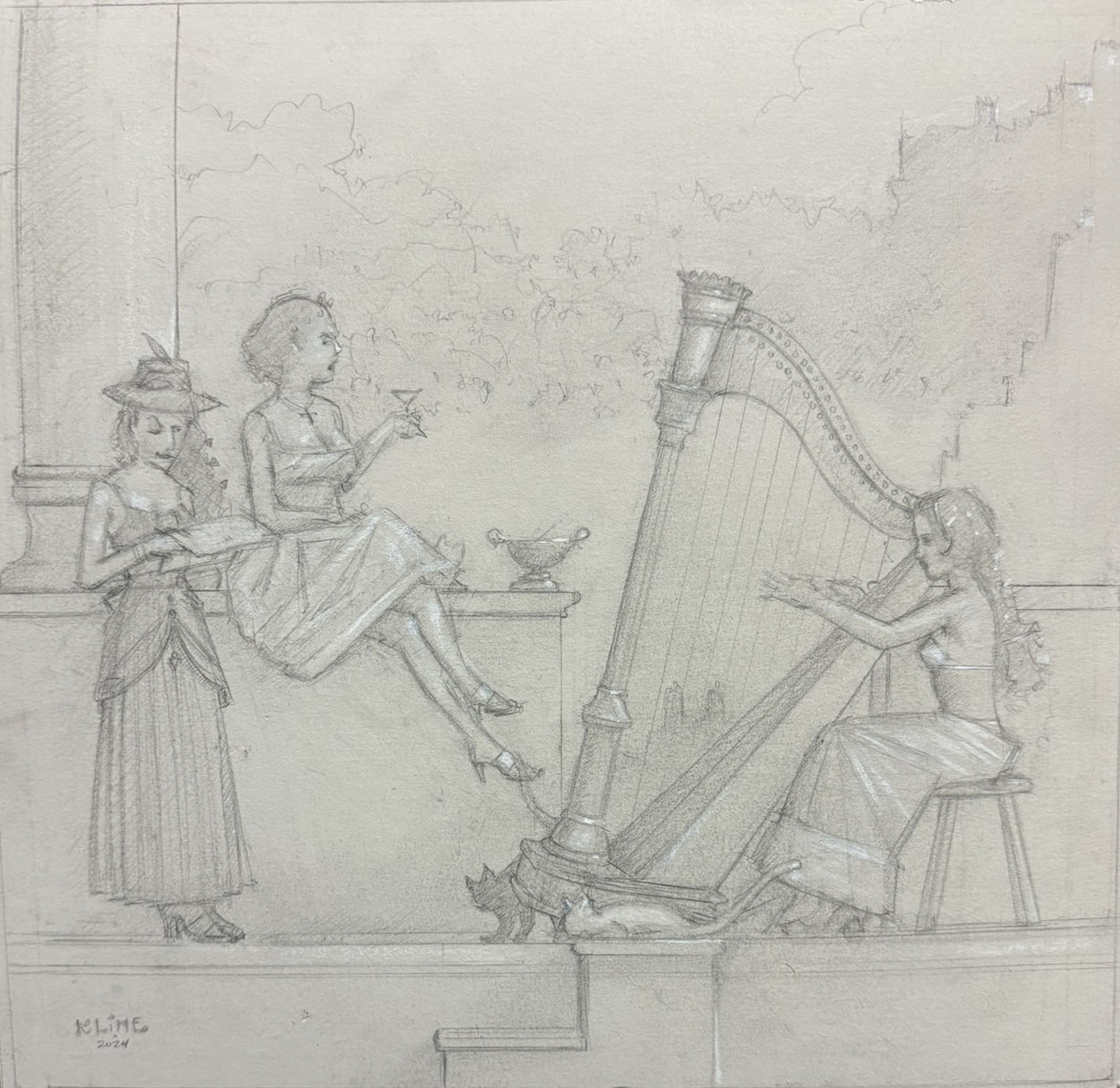
Most of my paintings currently are 18x18 inches or 18x24, due to standard frame sizes. So my preliminary half-scale drawings are 9x9 or 9x12. Michael Parkes says he might do a dozen or up to 30 half-scales before selecting one for a painting. I do not do this. I will do 2 or 3.
After any small scale studies, I'll do a full-scale drawing on Stonehenge pearl grey paper. The light grey paper allows me to study the light areas of the painting by adding conte crayon.
I will typically spend at least a week on drawings, often two weeks, and revise many times. I try to have WIPs in positions in my home where I can glance at them multiple times a day while doing other things.
For composition, I look a lot at lines and flow more than masses of value, but I visualize where my main lights and darks are going to be, and whether the light and shadows will work in the painting. I am obsessed with intersecting lines to establish complexity and slow the flow for a restful composition.
Panel Prep and Transfer Process
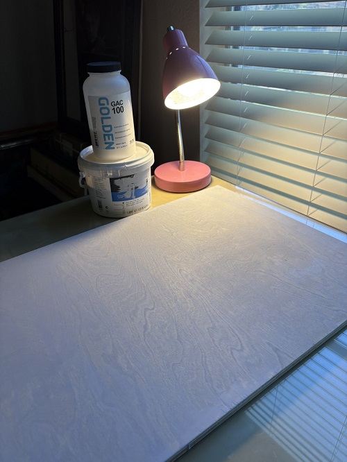
I use 1/2" birch panels from Home Depot currently. I have tried panels from Lowe's and also imported Baltic Birch from a specialty supplier. Neither were as good as the basic panels from HD. I used to saw all the panels myself with a handsaw to size, but now that I'm older and tired, I get the HD guys to cut the board, then I use patching material and sandpaper to fix the much worse jagged edges.
To prep a birch panel, I make sure there are no holes or imperfections of course. I apply a coat of acrylic sealer, currently GAC100, make sure it's well soaked into the wood, then scrape away the excess with a razor blade.
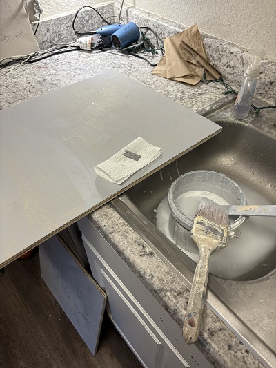
I tint my Gesso to a medium-light grey color. This is so my grisaille (underpainting) will be working somewhat from the middle out to lights and darks. This exact grey value has taken a long time to refine, to a grey that works for me. If the grey is too dark, it will hurt the colors of the painting, but if it's too light, it will be ineffective for its purpose.
For a lazy way to get some grey value scales, I picked up some free samples at Home Depot. You will want to thin the Gesso somewhat, enough so it's nice and runny, like paint, but too much water will weaken the gesso. Too little will be awful to work with, or your layer will be too thick. I do not do thick layers of gesso that might settle before drying, for that you are on your own. It seems bad to paint over very thick gesso.
I apply Gesso quickly with a housepainting brush and scrape away with a razor blade to make sure it is perfectly smooth. You cannot just use the brush. The layers will have brush strokes. You can try a foam roller and thin the Gesso down a lot. This will likely leave bumps, unless you use lots of water, but this is bad for the integrity of the Gesso.
When the Gesso is thick enough (2-3 coats), I sand with 400 grit paper and a random orbital hand sander to remove any brush ridges or other imperfections. If you don't like my sketchy razor blade hack (takes some practice and eyeing the blade for convexity), you'll need to sand like hell and maybe use a harsher grit sandpaper at first.
It's possible to avoid using the power sander if you use a razor blade skilfully. With no razor scraping, however, it's very difficult to get a super smooth panel with massive sanding. I dull the blade with sandpaper before using.
When the panel is ready, I use masking tape to fix the full scale drawing to the panel, only at the top. Then I slide graphite transfer paper behind the drawing paper, and go over every single line with a small wood-handle ball stylus from Amazon. I believe these are normally sculpting styluses. Styli?
All graphite transfer paper is not created equal. Some will goo your panel worse than others with gummy graphite material. I remove all excess with kneaded erasers.
Now I have a faint drawing imprint. I rebuild this drawing in full, from this imprint. I often obessively make significant corrections in this phase as well, to the drawing composition. This drawing needs to be perfect, the more you have to work with, the less you have to struggle with the shapes in the painting phase
Imprimatura, Underpainting Process
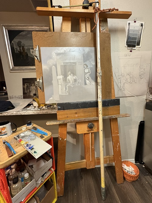
Currently I am doing a thin rub-in of linseed oil before starting the first underpainting on the grey-toned ground (gesso panel). This is to compensate for the soak-in of oil into the acrylic. The oil absorption is bad without the GAC100 sealer, so that's why I started using it. There may be some better, newer products for this purpose now on the market.
I do either a grey grisaille for a sky scene, or a verdaccio (green monochrome) for a green tonal painting. I try to get my main areas of lights and darks worked out here. Currently I am experimenting between making the grisaille with Mars Black or Ivory Black. I use lead white mixed with titanium here, using more titanium to build up lights but never pure titanium. For verdaccio, I avoid using much white, and also use subtractive process with a rag to get lights.
Like Vermeer, I use cheaper paint materials for the underpainting layers (Gamblin and Michael Harding lead at the time of this writing, since Gamblin does not do lead.) I like Gamblin Earth Green for verdaccio. This is NOT true earth green. It is a mix of Viridian and Raw Umber.
After a first underpainting, I let the painting dry for at least a week, more often two weeks. Lead white and also Raw Umber in the imprimatura helps speed drying time because they are siccative colors, as they were called back in the day. Then I do a second underpainting. I'm refining and strengthening the lights and darks further in this layer.
Painting Process
I am lucky to have a Blick store near me, but I buy most of my paints from their website for convenience. They lock the Old Holland paints inside a glass case at the store, for example. I use Gamblin, but prefer OH. I have never used Vasari, mainly due to it not being offered at a convenient retailer. I am not convinced about Michael Harding. If I just need one tube of Gamblin or MH paint, I will often grab it off of Amazon due to less shipping charges.
I will typically build up color on a painting the same way I built up the lights and darks, adding a little at a time, and strengthening with mutiple layers. I use progressively more lead white in the upper layers, and try to avoid titanium. I would never start out with something much too bright blue, for example. That can turn into a headache.
Currently I like using Raw Umber to unify my painting, because it harmonizes well with most other colors. I will try to get a little bit of every color on my palette into every surface of the painting, to pull the painting together.
In the final layers, I will use a palette knife to add effects to the clouds, and possibly a razor blade combined with a palette knife for surface complexity on the marble or stone surfaces. For some reason, I have never motivated to try-hard the "faux marble" effect, like Michael Parkes, but I could go for an aged marble surface like Alma-Tadema. I am trying my own sort of more modern, tonalist, alla-prima-esque look for architectural surfaces right now.
In the past, I had serious problems with each layer of paint drying too resistant and not taking new layers without "beading up". Long story short, currently I have solved this by using at least partial lead white in my white mixes, never 100% titanium in any area, and also adding at least some Utrecht Classical Painting Medium (if not 100%) mixed into refined linseed oil medium. Some dammar in the medium softens the surface somewhat.
I have tried Alkyd mediums and paint with alkyd binder, but do not like how they look when dried in. There is something about the resin that causes colors to lack some vibrancy. Maybe it is my imagination. The alkyd surface is also sort of weird and slippery to paint over.
With the classical dammar in your medium, you need to worry about rubbing off the previous layer if you do a rub-in (which I do.) So it's important to give plenty of drying time between layers. I do 1-3 weeks. If I use a lot of titanium in the underpainting, for example, it will not be dry enough in one week. To thicken the Utrecht Classical Oil Painting medium, you can add some stand oil to it (not too much.)
I am currently varnishing my paintings with old school dammar varnish. This is mainly because I do not trust modern materials and varnishes. But I don't like the super-glossy surface of dammar, so would like to explore other options that have less glare and reflection. I am not too worried about yellowing with my current paintings because I paint very cool, and think the paintings will be improved with some yellowing. This is also why I prefer gold frames, and avoid cool silver that might look good now, but not later.
Thanks for reading. If you have any questions or concerns about my process, suggestions, and ideally can back up your opinions with references that you can provide, if they are questionable at all, then please open a discussion at randklineart@gmail.com, or reach me at ElvenAcademy (u/Si1verange1) on Reddit. I am always looking to improve!